Most layouts look best when the designer chooses at least two fonts to set the text: one for the headline or title and the other for the body (or bulk) of the text on a page. By following (or selectively breaking) the rules that follow, you’ll set yourself up for a well-designed font pairing.
1. Limit your font palette to (in most situations) 3 fonts
While some projects will call for more elaborate font combinations, like when you’re designing a particularly decorative aesthetic, most layouts will benefit from restraint and forethought. If you do choose to use a variety of fonts, the overall effect should be harmonious without being conflicting or cluttered.
A good way to refine your font choices is to ensure that each font has a specific role or purpose in your design. If you can’t find a specific job for a font, it might be time to take a look at your choices.
2. Use contrast wherever possible to create a visual hierarchy
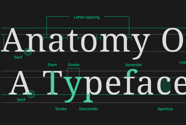
Qualities such as size, weight (or boldness), and spacing (including leading, the space between lines, and kerning, the space between letters) all play a role in how the viewer should navigate the page and what text should attract his or her attention first.
Decide what parts of your design are essential and which are less importantTwitter Logo, and let your font choice reflect those priorities. More often than not, the more important a text element is, the larger and weightier its font will be.
3. Keep an eye on moods and history
This is where the process stops being technical and begins to get a bit more subjective. You’ll want to ensure that the moods evoked by your choices fit the intent of the project. An invitation to a child’s birthday party has a little more leeway when it comes to decorative fonts than does a professional resumé or a portfolio page.
You should also keep an eye on the genre or historical context of a font, particularly when designing a project with cultural leanings. Font styles can play a big role in cementing the overall look of your designTwitter Logo, especially if you’re going for a certain aesthetic, so do some research and you’re more likely to find the pitch-perfect font choice.
“Ensure that each font has a specific role or purpose in your design.”
4. Understand your brand and know what you want to say
Are you designing a project that has a bit of personality? Or are you putting together a presentation for your company’s board of directors? Knowing what you want to say and the audience to whom you’re speaking is important for both content and presentation.
Likewise, if you’re designing materials for your brand, make sure your font choices reflect your brand’s values. A company like Airbnb or InVision can utilize a font with a bit more whimsy than, say, General Electric or IBM. Choose fonts that work with your existing branding and you’ll run a lower risk of sending mixed messages to your audience.
5. Trust your gut
The decision about whether or not two or more fonts complement each other can feel like something of a guessing game. You’ll often find yourself relying on instinct or a gut feeling. That’s ok. You’ve got this.
If you make a point of noticing how fonts combine well (or not) out in the real world—on products, in magazines, on websites, and in books—you’ll start to develop an innate sense for what works and what doesn’t.
Fanguy, Will. “5 best practices for effectively pairing fonts” InVision, 2 Jul. 2018, www.easybib.com/guides/10-ways-to-spot-a-fake-news-article/.